Effective Flyers
Designing marketing flyers that are eye catching, engaging and not overwhelming is a tough task, one that needs a bit of planning and a decent amount of work. This week, we’re going to talk about some strategies to make flyers that turn your walk ins into members.
Let’s take a look at two different marketing flyers, conveying the same information in different manners, to give you a feel for what flyer design can do for you. Then we will break it down into segments.
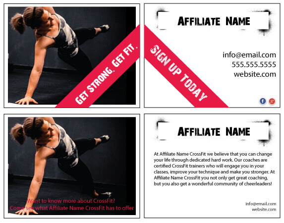
The contact info and branding are clearly present, along with social media links that you use. It is clean, simple and designed to get someone to email you – that’s it. You aren’t trying to tell them all about who you are, what you do etc. That is what you do when you hand them the flyer.
The bottom flyer is much different. While still containing a strong photo (which is the saving grace), there is too much text on the front and back. Not only that, but the text on the front is difficult to read. The contact information is smaller, almost like a second thought, and the social media icons are completely missing.
When you design your flyer, remember what you want someone to do with it – you want them to contact you, you want them to sign up for a trial class. Essentially, you aren’t selling your whole philosophy, you are selling a second, slightly larger hook to get them in the door, where you can get another shot at them.
Plan the message of your marketing flyers
The first step to designing a good flyer is to sit down with pen and paper and write down what information is required and what your overall goals are. Key information to include is how to get in touch with you, you certainly want your website, email and phone number. You can also consider putting social media icons that you blog to or a QR code that takes them to a specially designed potential clients page.
Think critically about text you want to include, such as your mission statement, an explanation of what fitness is, testimonials etc.
The often touted rule that “less is more” applies here, choose only one major text element, don’t fog up the flyer with too much information at once. Your walk in is only going to glance at this; if they are truly interested they will email you or visit your website – when that happens it is high time to start adding more bits of information to get them in the door.
For now, with the flyer, work on reducing the amount of text, what is not vital? What can be made more concise? Use bullet points as a way to break up information into bite sized chunks.
Graphics, graphics, graphics.
Finding or creating graphics for your flyer can be intimidating. You might have photos of your members that you took from your phone, but these likely are not what you want to use on the flyers.
You want to keep your background graphics simple and blocky with little detail. Having too much detail in a background photo, logo and text is overwhelming.
Search Google for free stock images that you can use or use design software to tweak your photos to filter out some of the detail. Gimp is one of the best free image editing and design programs that I know of – and they have tons of video tutorials.
Headlines
Once you have your background images setup its time to start adding the information. Use interesting fonts and semi-transparent boxes behind the text to allow some of the image to come through, while still leaving the text readable.
The nitty gritty
On the back of your flyer you want to put the information that you have sliced, diced and cut down as much as possible. You want to keep this concise and use changes in font color, size and style to help the eye move across the flyer. Make sure the font style you choose is easily readable, especially at the size you use on the flyer.
Branding
Make sure to base your flyers around your business colors, logo and overall styling. It wouldn’t make sense to use flowing soft font in a flyer if your potential clients and your business is based around tough, sweaty workouts. If, however, you are promoting the relaxation of Yoga, then the curly flowing font would be more applicable.
If you want to give out more information then you really want to design a brochure, which we will talk about in the next issue!